Learning about Lognormal Distribution
What is a lognormal distribution?
From the intuitive perspective, a quantity or variable is likely to be lognormally dsitributed if it often changes by a percentage. For instance, a stock’s return could go up by 5% today but decrease by 10% the next day. A lognormally distributed quantity \(Y\) can be expressed as the cumulative product of many positive, independent numbers, as \(Y = X_1 * X_2 * X_3 ... * X_n\).
Because each factor \(X_i\) is positive, we could express \(\log Y\) as the sum of \(\log X_i\), as \(\log Y = \Sigma_{i=1}^{n} \log X_i\). Because the \(\log X_i\) is independent, we can apply the Central Limit Theorem and claim \(\log Y\) is normally distributed.
Thus, from a data perspective, a dataset is likely to be lognormally distributed if its \(\log\) appears approximately normal. On the other hand, a lognormal distribution often looks right-skewed.
To confirm our intuition, lets run some simulations!
Simulating lognormal
Situation 1: Normally distributed change
In this situation I simulated 10k data points that go through 30 change periods. Each data point starts with value 1 (100%). In each change period, its value multiplies a factor that is normally distributed with \(\mu = 1\) and \(\sigma = 0.1\). In other words, each data point either grows or shrinks a small percentage in each period for 30 periods in total.
Below is the mathematical representation of the simulation.
\(\begin{equation} \text{sample data point} \, i = Z_1 * Z_2 * ... \color{red}{Z_{30}}\\ \end{equation} \\ \text{where} \, i \in \{1,2,...10000\} \quad Z_i \sim \mathcal{N}(\mu=1,\sigma=0.1)\)
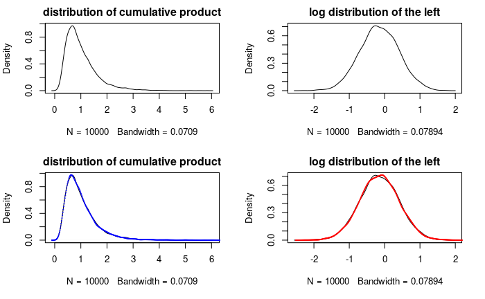
Caption: The top-left is the distribution of the simulated data. The top-right is the distribution of its log. For the bottom-left graph, I first estimated the fitted parameters of the lognormal distribution, then I use the parameters to generate 10k data and plot the lognormal density curve, along with that of the simulated data. The bottom right graph is the same but with both simulated data and the lognormal data logged. (the details of the fitting process can be found in my Github repo,)
From the density curves, the simulated data almost overlaps the fitted lognormal distribution; the same goes with their corresponding log data. This shows that lognormal distribution is good at representing a quantity that grows or shrinks with equal probabilities.
Situation 2: Arbitrary growth
What if the change is not symmetric but more arbitrary? For instance, housing prices are often growing in the long run. In situation 2, we model a random quantity that only grows while following our lognormal assumptions (cumulative product of positive, uncorrelated variables).
Each data point grows either 5% or 10% with equal chance in each period. Additionally, I simulated 10k data points that undergo 30 growth periods and another 10k data points that undergo 100 growth periods.
Below is the mathematical representation of the simulation.
Period 30:
\[\begin{equation} \text{sample data point} \, i = G_1 * G_2 * ... \color{red}{G_{30}} \end{equation} \\ \text{where} \, i \in \{1,2,...10000\} \quad P(G_i = 1.1) = P(G_i = 1.05) = 50%\]Period 100:
\[\begin{equation} \text{sample data point} \, i = G_1 * G_2 * ... \color{red}{G_{100}} \end{equation} \\ \text{where} \, i \in \{1,2,...10000\} \quad P(G_i = 1.1) = P(G_i = 1.05) = 50%\]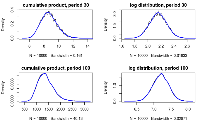
Caption: The top left graph is the distribution of the simulated data with period 30 and the top right is its log. The bottom row is the distribution of simulated data with period 100 and its log.
Here are two important things we could learn from the graphs:
-
The fitted distribution (the blue curves) still overlaps a significant portion of the simulated data, especially for period 100. This provides good evidence that the lognormal distribution is a good fit for the cumulative product of uncorrelated variables, regardless of the distribution of those variables (I highly recommend that you to try out other distributions to see the results for yourself.)
-
Note the distributions of period 30 is bumpier than that of period 100. This confirms our inference of \(\log Y\) will be normal using the Central Limit Theorem: as we increase the growth period from 30 to 100, we increase the number of variables added to \(\log Y\), thus the distribution of \(\log Y\) will converge to normal regardless of the distribution of the numbers added. In other words, the distributions of factors \(X_i\) matters less as we have more of them.
Lognormal in the real world
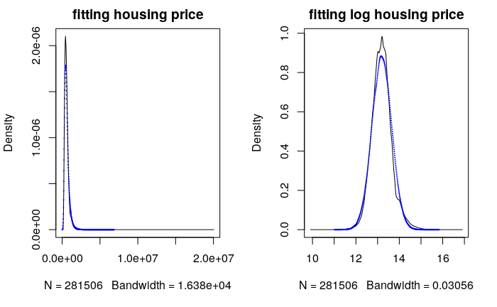
The lognormal distribution fits two different simulations very well, but it is most important to see how well it fits in real world data. Now I will show you that the distribution of house prices can be well approximated by a lognormal distribution. I looked at the distribution of housing prices from mid-2003 through mid-2006 in the SF Bay Area. Below is the fitted log-normal distribution of all the housing prices.
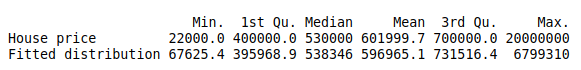
Caption : The table above shows the statistics about the housing prices and the simulated price from the lognormal fit. All the statistics are fairly close with small percentage deviation except the minimum and maximum.
Overall, the fitted lognormal distribution could capture most of the housing price distribution but not the extreme values. Additionally it underestimates the density of the most popular house price. Maybe in the real world, sellers tend to match the popular (most frequently sold) prices.
As for the outliers problem, I think the real world is too complex for a statistical model to capture it perfectly. However, I am interested in what percentage of the data the lognormal distribution could reasonably fit/explain. So I decided to eliminate 25 outliers out of 280k data points. Below is the fitted plot and the range of both data(top:housing data, bottom:simulated data)
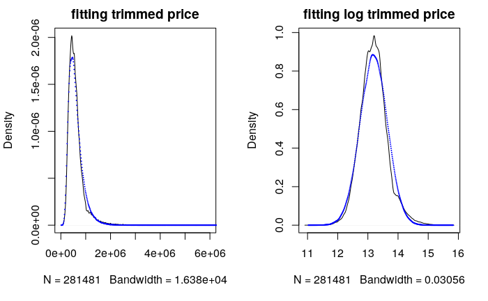
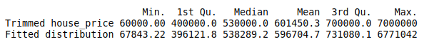
After trimming a tiny fraction of outliers, the fitted distribution matches closely with the actual housing price even in the extreme values. This illustration shows that the lognormal distribution can be used to model a significant portion of the housing price distribution. Thus we have good evidence supporting the claim that housing price is lognormally distributed. Therefore we can infer it may often change by percentage rather than absolute amount.
Wrapping Up
In summary, the lognormal distribution is used to model a quantity that often changes in percentage while a normally distributed quantity often changes in absolute size. I hope you could get a good intuitive understanding of the lognormal distribution and later learn to use it in your data analysis or modeling process.